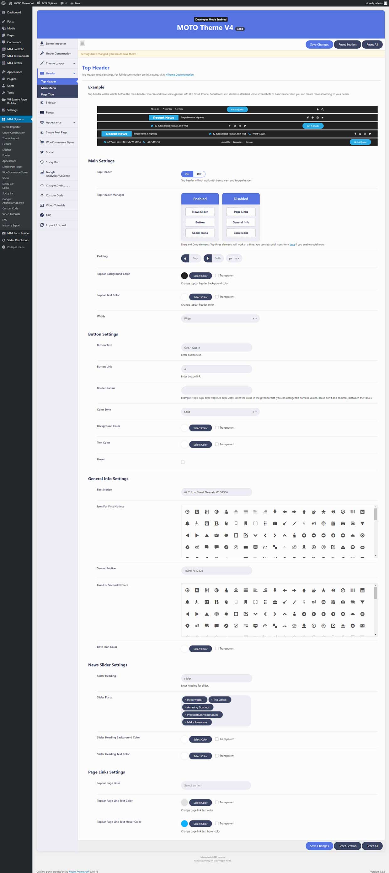
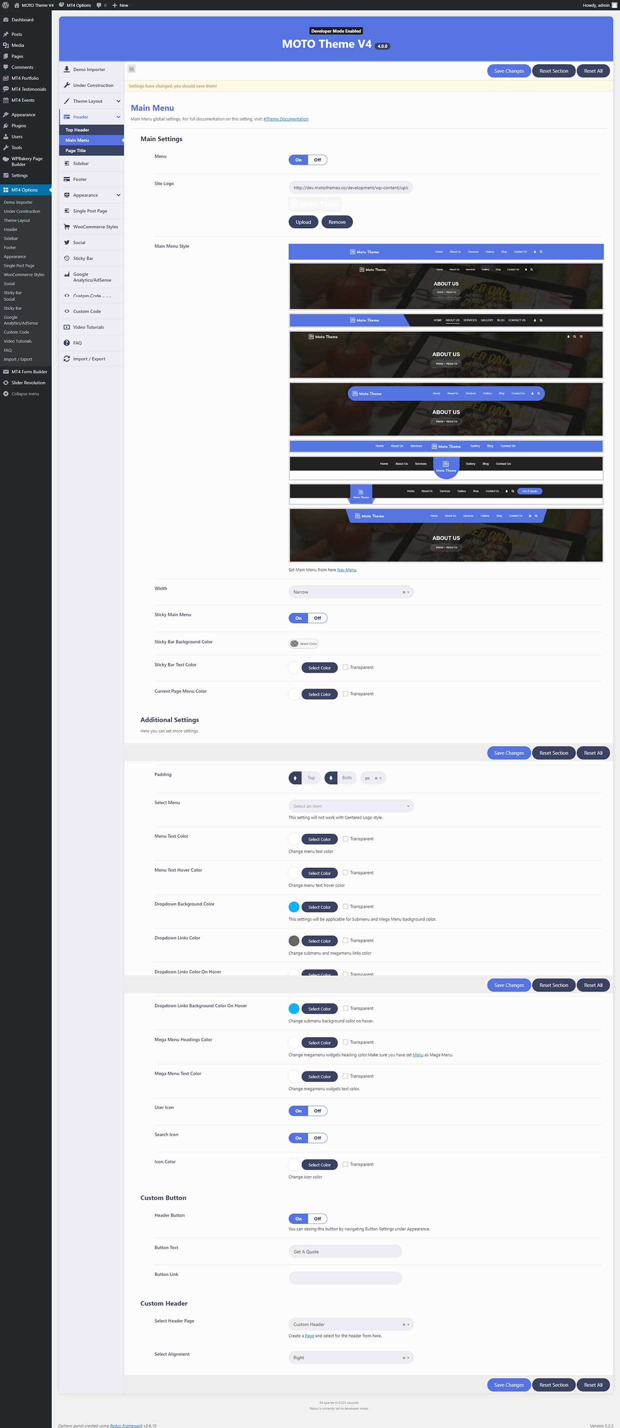
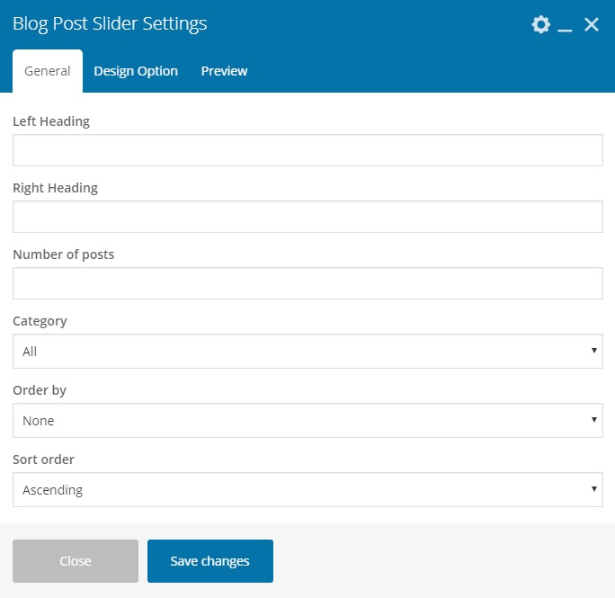
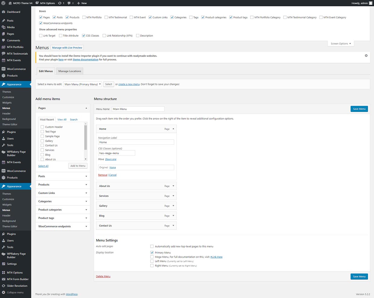
5.4.2 Main Menu
Using these settings user can redsign main menu of the site.
Main Settings
- Menu - To design the main menu, you have to enable the "On" button. Off will hide the main menu from the header part.
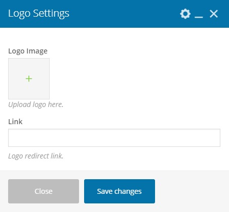
- Site Logo - In this setting, the user can set a logo in the main menu area.
- Main Menu Style - In this setting, the user can select and change the main menu style. There are nine option are available for you to select for your site. (Default, Transparent, Multicolor, Toggle, Centered Logo, Capsule Header, Centered Large Logo, Skew Header, Left Large Logo. )
- Toggle Menu Position - In this setting, you can change the position of the toggle header where you want to show in the main menu. This setting is only applicable for the toggle header only, and the remaining eight headers have the same setting.
- Social Box Color - Using this feature, the user can change the background color for the social icons. This setting is only applicable for the toggle header only, and the remaining eight headers have the same setting.
- Width - You can also change the width setting of the Main Menu. By selecting one option between narrow and wide.
- Sticky Main Menu - To apply this setting user need to enable the "On" button. Sticky, navigation is basically a website menu that is locked into place so that it does not disappear when the user scrolls down the page. In other words, it is accessible from anywhere on the website without having to scroll.
- Sticky Bar Background Color - User can change the background color of the sticky bar.
- Sticky Bar Text Color - User can change the text color of the sticky bar.
- Current Page Menu Color - User can change the curent page menu color of the sticky bar.
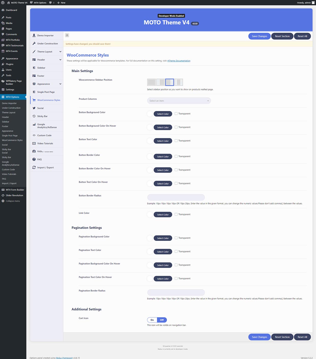
Additional Settings
This is the additional settings so that users can set more settings of the main menu area.
- Background Color - User can add or change the background color in the main menu area.
- Padding - Padding goes around all four sides of the menu bar and you can target and change the padding for each side.
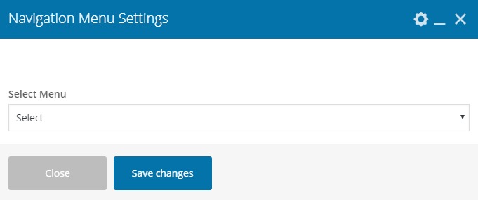
- Select Menu - This setting will not work with Centered Logo style. You can memnu for the main menu area.
- Menu Text Color - In this setting, the user can change or add menu text color and the user can also select the second option transparent.
- Menu Text Hover Color - In this setting, the user can change or add menu text hover color.
- Dropdown Background Color - By this setting you can change background of the dropdown menubar. This settings will be applicable for Submenu and Mega Menu background color.
- Dropdown Links Color On Hover - By this setting you can change color of the dropdown link on hover.
- Dropdown Links Background Color On Hover - By this setting you can change the background of the dropdown link on hover.
- Mega Menu Headings Color - By this setting, you can Change the megamenu widgets heading color. But Make sure you have set Menu as Mega Menu.
- Mega Menu Text Color - By this setting you can Change the megamenu widgets text color.
- User Icon - You can add or remove the user icon from the page by the help of this menu.
- Search Icon - You can add or remove the search icon from the page by the help of this menu.
- Icon Color - You can add or remove the icon color from the page by the help of this menu.
Custom Button
Using this, user can add a button to the main menu area.
- Button Text - Users can add the label for the button, by this option.
- Button Link - You can add the link for the button, where you want to redirect it.
Custom Header
Using this, user can design their own header. For this, the user has to create a page using the drag and drop page builder and set it from here.
- Select Header Page - You can Select the header page here, which you make in the pages menu.
- Select Alignment - You can adjust the alignment of the header page.


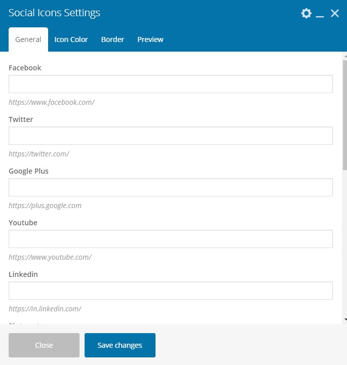
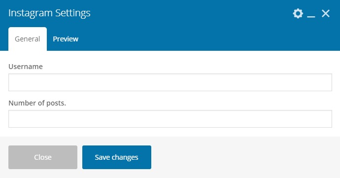
5.10 Social
5.10.1 Add Social Page URL
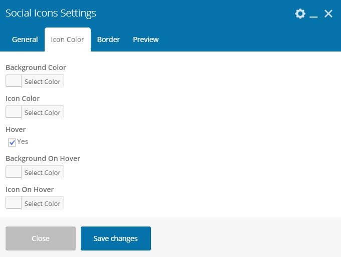
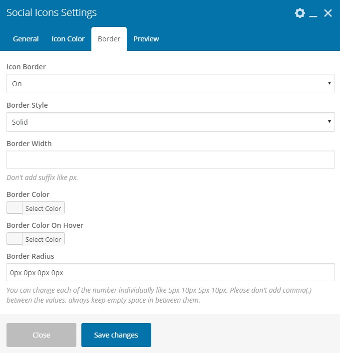
5.10.2 Social Icons Design Setting
In these settings you can design the social icons.